Brief
Our customers, Eddie and Sandra, relocated to Perth for its high quality of life and connections to other Scottish cities where their children live. Their canny purchase was a 1980s timber-framed bungalow in the walled garden of a large townhouse. The elevated site has far-reaching views across the city to Highland Perthshire.
The property was well maintained and able to be well insulated, making it perfect for an aesthetic and functional renovation. As well as opening up the interior spaces for more modern living, the use of contemporary materials flows through their home, linking internal and external spaces. Our customers cherish good design and have taken great care to make a home that is welcoming and calm to enjoy.
Eddie and Sandra wanted their new bathroom to link to the rest of the house. Having left this room until last, they wanted a functional room that would serve them for years.
Design
Whilst our customers had explored other functional options, they found nothing that made their “heart sing”. They felt that some other options would have felt out of place. They very much wanted their new bathroom to link to the rest of the house, as opposed to being wonderful but dislocated.
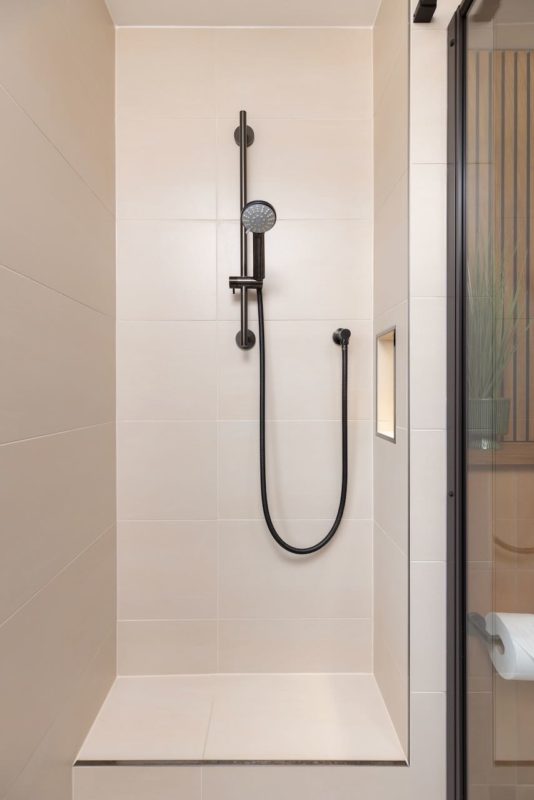
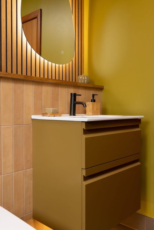
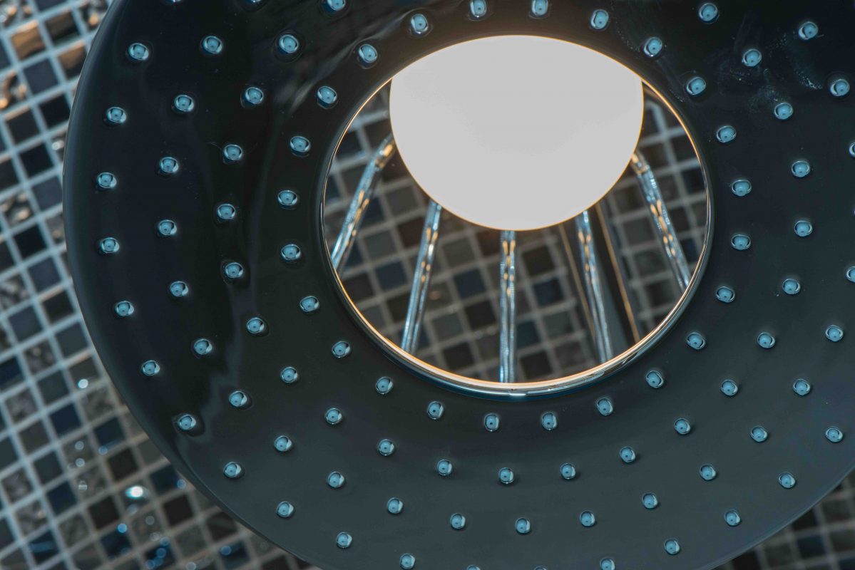
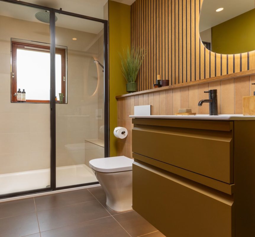
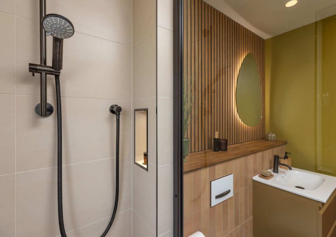
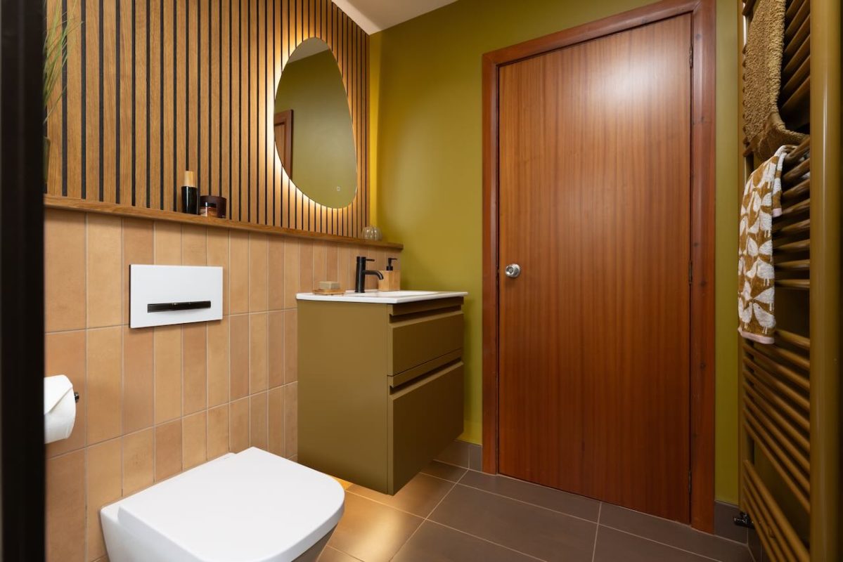
The original bathroom had a bath across the end of the room. Fiona, who led the design, proposed a shower room with a tiled seat to make a functional and designed space. A Drench shower enclosure in Gunmetal grey, with Coalbrook brassware, also in gunmetal, contrasts with the brighter walls and tiling. The room is finished with Roca, Geberit and Dansani sanitaryware and furniture, with tiles from Villeroy and Boch, Dune, and a bespoke towel rail by Zehnder.
Eddie said, “Fiona listened and understood our hopes for our new room. She absorbed all our list of wants. She recognised our need for a room to support us through future life stages.”
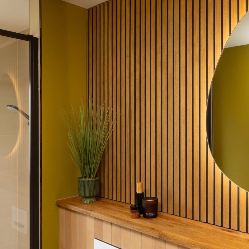
The new room drew on the existing colour palette of Luxurious Walnut, Wild Monsoon and Family Tree, with slatted oak Acupanel wood panels linking to the rest of the home. Fiona used our 4D and private presentation area to allow Eddie and Sandra to discover their new room.
Whilst perceived as more expensive than some, the design quality “shone through”, and very few changes were made.
We developed a proper understanding and had a meeting of minds with a distinct design aesthetic. Our clients were impressed with the care and attention given through site visits and discussions to understand their needs and utilise the existing aesthetic with design flair.
The project was managed by Michael, drawing on the entire skillset of our in-house installation team: joiner, plumber, tiler, electrician, and decorator.
The installation was described as efficient and quick, “a breeze’. Care was taken to protect all elements of the recently renovated property.
